First, I would like to say that I thoroughly enjoyed watching this documentary. It was a feel good story that allowed us to see life from a totally different perspective, I really enjoy things that challenge my mind to think differently. Second, it was a great way to see design as a form of advocacy. The fact that those students were inspired and motivated enough to work on various projects and think critically really advocates for how design works. Design allowed these students who are basically living in the middle of nowhere in North Carolina to change their thinking. Before high school kids aren’t really inspired to do anything because they usually end right back up working on their families farms. But this design class showed how design isn’t boring, its active, fun, interacting, and most importantly different. All the kids had nothing but nice things to say about the program, and I’m sure it gave them a whole new outlook on life. It is important that people see design this way because its not just a bunch of weirdos making weird things. It is life changing if you allow yourself to open up to the idea of design. People also need to wake up and see how design is life changing, another way this movie advocates for design is that even though they accomplished so much, there was still no money in the budget to afford it. There has to be a way to find money to afford such an amazing program. This doesn’t just go for Bertie, North Carolina, it goes for school districts across the world. Allowing your school to have a design program lets students do something fun and learn in a way that is 1,000,000,000… times better than learning in a book and listening to a lecture for hours. The documentary was great, I really hope people can watch this and see how important design is.
Designer 11-12
Designer 11:
Rebekah Radtke, an assistant professor at the University of Kentucky school of interior. One of the few designers who started and finished her undergrad with the same major, interior design. She then went on to get her masters in Architecture. She explained her current stance on design by saying that its about people, interior spaces are everywhere, its a collaborative field, empathetic, optimistic, and experimental. And as far as design in the future, it lies with the people in our class. “Some of us want to be designers while others don’t but eve if we pursue different occupations, we can still collaborate in solving problems”. She also said “we need people who aren’t designers to appreciate design”.
Designer 12:
Anne Filson, she was originally a history major in her undergrad studies and then moved on to get her masters in architecture. She now works in the School of Architecture here at UK. She was actually able to do something amazing, to go to Europe and work with a famous designer. Her current stance on design is “design is a part of the everyday world and no design is a bad design”. She worked with IDEO and did multiple design projects. Anne has also done research on AtFAB, an on-site fabrication project. As far as where she sees the future in design, she says that stories will be able to fabricate their own furniture through different programs and machines to keep industry in the U.S. Anne was great, but really I couldn’t find any similarities between the designers, they both studied very different subjects.
Designer profile 9-10
Designer 9:
Adriane Grumbein, she works in the Integrated strategic communications, within the communications college at the University of Kentucky. When Adriane was an undergrad, she was an art major, realized it really wasn’t for her so she changed to a integrated communications major with a graphic design minor. Currently, Adriane believes that design is all about problem solving, you must organize information visually and put it in to practice. “Design is also about working with a client trying to solve their problem, it is not always pretty, but that’s really not the point”. Adriane believes that the future of design is heading towards big data, infographics, and personalization. She says that the designer is the interpreter between the big data and pretty pictures, really what she means by that, is being able to influence people through their data to buy something or be intrigued by something that the designer creates. Adriane was really cool, she got straight to the point and I can tell she is very serious about her work.
Designer 10:
Julie Sniadowski, she is currently our TA, and a graduate student here at the University of Kentucky. She also did her undergrad here, something really great was that she was able to attend the governors school of art in Virginia. While an undergrad she went to study abroad in Paris and Rome. While there she had a project to create a building that would fit in with the design style of these places. She finds a lot of pleasure working on design projects. After graduate school Julie is looking at various internships that would benefit her in the design field. I didn’t really here her say where she sees design now, but if I had to guess she seems very passionate about creating new things and making design something beautiful. Julie sees design heading for a lot more collaboration with other fields like engineering for example. In order for any field to grow design has to be an intricate part in it, without a good design it is hard for something to grow correctly. Between the two, they were very different. Julie was more about creation of something pretty while Adriane was more on the business side creating something that will sell.
Designer Profile 7-8
Designer 7:
Melody Jackson, she started her college career studying pre-med, but then she got inspired by Leonardo DaVinci, she then transferred to the architecture school at the University of Kentucky. After she graduated from UK she went to Cornell University for grad school. After grad school, Melody really got in to painting, the way she describes her thought process while painting is amazing. There is really no restrictions for her, she just paints what inspires her. Her current stance on design is that it is a journey, it doesn’t really matter where you are going, all that matters is what you see when you’re on the way. Her famous quote is “Exactly what you expected: something unexpected”. Melody’s future of design has a lot to do with Virtual reality, soon you will be able to physically design something right in front of you.
Designer 8:
Lindsey Fay, teaches at the school of interior here at the University of Kentucky. She is originally from the state of Pennsylvania, but she came to UK for college for nutritional school. While in school she couldn’t really express herself, so she switched her major to architecture. She does quite a bit of research in relation to architecture design, one of her recent projects was to see how the medical buildings were designed, and how people were interacting with the design. Her current stance on design is that people have the power to influence the way design is right now, without us there is no design. She sees design in the future heading towards social responsibility in design. She believes we will have the power with design to make the world a better place. It is interesting to see the difference between these designers, Melody is on a really large scale, broadening her projects while Lindsey was pretty central, focused on architecture.
Designer Profiles 5-6
Designer 5:
Ryan Hargrove, he works in the department of landscape architecture at UK. He also went to UK as an undergrad student, his story was very interesting about how he learned about landscape architecture, it’s awesome to see how things work out. Ryan says that his mother and father were huge influences growing up allowing him to be very creative and engage in critical thinking at a young age. It is really cool to see how Ryan and his team is able to look at a vacant lot and design it to plan for the next 50 years. As far as what’s next for design, Ryan says that we are all designers, it is a way of life, and it is up to us to take the torch and improve design every day, he also sees landscape as the umbrella over design.
Designer 6:
Sarah Daley, she was an architecture major and anthropology minor at the University of Kentucky. She just moved back to Louisville from her internship in Chicago. She is currently an interpretive designer who collects a lot of information relative to design and decides how it should be interpreted within the media. Sarah currently feels that design is definitely a part of everything that we do and that every day we should stop to realize how big of an influence it has on our lives. Technology design is what she sees design heading to, Sarah described how information is used with technology and that there will be a lot of interesting connections between the two. Sarah and Brian have quite a bit in common with their outlook on design which is interesting because their jobs are so different.
Design Profile 3-4
Designer 3:
Scarlet Wesley, she currently works at the University of Kentucky working right next door at Erikson Hall, she teaches working in merchandising and textiles, and brand management. She got her masters degree and PHD at Tennessee. Her first job when she moved to Connecticut was allocation and planning at a store like Walmart. From her experience she landed a job at Legos in their corporate office. Overall she took away a new outlook on design for products, and how the choices are made to put certain products in certain stores. She was also able to take away a new aspect of life through her experiences. She was able to talk about where she thinks design is going to go, wrapping it up she was very adamant about the brands sort of going away and we are now able to choose more things that we like instead of associating with a certain brand.
Designer 4:
Ebrahim Poustinchi, is a part of the UK faculty working with interior design, doing interesting products with robotic designs and much more smaller projects. He went to the University of Iran studying architecture and digital design. He has taught at UCLA and Washington state, now he finds himself here! First off, wow. The kind of projects that he is a part of is absolutely amazing, and much more abstract and different than the norm. Ebrahim is very modern and extremely different that Scarlet because they work on completely different aspects. Scarlet works with the business side while Ebrahim works on full frontal design. From what I can see, Ebrahim sees the future of design as far as making things look and feel more exotic. With all his projects he is doing great things in the world of design.
Design Profile 1-2
Designer 1:
Mark O’Bryan, he graduated from the University of Kentucky in the school of Architecture. For Mark, it all started with his love of stereo systems and cameras and from then on he was always curious about how things are constructed, and how can you construct something with a great design as well. Mark likes a lot of old fashioned things, preferably from the 1960s. Therefore he sees design going in a bit of a remodeled version of design from the old. What I got from Mark was that, it’s not always about whats there, but its about what you can add/build on to it to make the design truly great.
Designer 2:
Jennifer Tate, she graduated from UNC Greensboro with a material agriculture degree. Jennifer now works for LG in New York while also having other small design projects on the side. When listening to Jenifer she seemed much more modern than Mark, which ultimately is their main difference. Jennifer sees design really being focused on wearables, with new technology. She also said her favorite social media tool was Instagram because of all the cool things it allows you to do with your pictures. It was interesting to hear how she described the future of design because, being young, she knows how to take advantage of our generation and design things catered to our style.
Museum of me
The museum of me consists of these 10 artifacts:
- My backpack
- My Macbook Pro laptop
- My Playstation 4
- My UK Nike basketball
- My Nike football
- My iPhone 6+
- My wallet
- My keychain
- My black UK hat
- My TV
These artifacts tell a lot about me. My backpack and my laptop say that I am dedicated to school, it is number one for me. The playstation 4 says that I like to take a few breaks here and there, wind down and play video games. My UK nike basketball and my nike football says I love sports, I love watching them and playing them. My iPhone 6+ says that I love technology, and seriously, who can write artifacts describing themselves without talking about their phone? My wallet and my keychain at first glance don’t really say much at first, on the outside everyone has a wallet and a keychain right? But for me they are a lot more special then that, within my wallet I have pictures of my loved ones that I look at whenever I am down and it picks me up. With my keychain, this is the last thing I have that reminds me of my papaw, he died a few years back and I was able to keep his UK keychain. My black UK hat says a lot about me, although I do have a ton of hats, I wear this one the most. It represents my dream school, and wearing a hat is really who I am. My Tv says that I love watching tv, whether its sports, tv shows, the news, etc. There really isn’t to much thought in to design when it comes to these artifacts, they are all pretty simple. But I would say some of the most important aspects of design used are the logos on my computer, hat, football, basketball, and my iPhone. These logos (Apple and Nike) really shows what I care about in terms of technology and sports. Truth be told thats really all I use when it comes to artifacts. As far of my views and values go, the design represents that I like the simple look, but the quality brand.
It’s FONT-amental
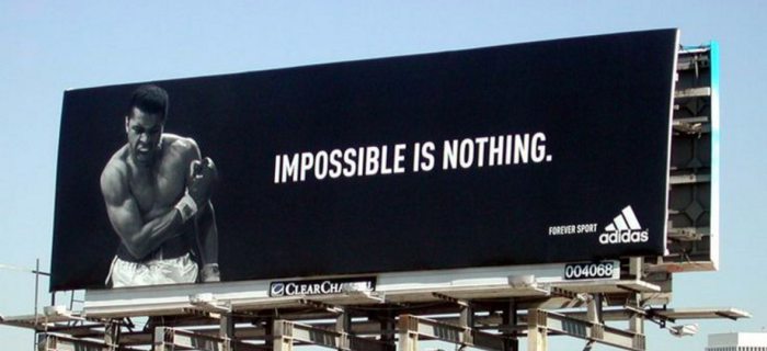
The font used for this adidas logo is ITC Avant Garde Gothic Std DemiBold. It is located in Louisville, Ky. While the designers were making this billboard they knew that Louisville had two very key marketing aspects, 1 Muhammad Ali was born there and the University of Louisville is sponsored by them. They probably chose this font because it is very easy to read, yet it has a slight difference than most athletics fonts with its odly rounded letters.
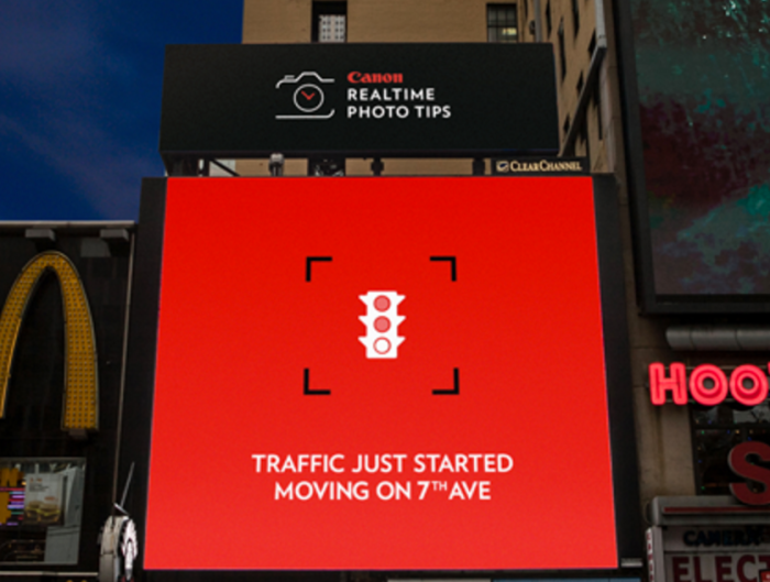
On the top you can see the digital screen that has the canon logo on it. The font they use is very interesting, it is called Basic Latin. It allows all the letter to kind of cut in, and you can really tell with the C. The designers placed this digital screen in the middle of New York, and they probably chose the font to stick out and be different. Which makes it help onlookers spot it even though it is relatively small.

http://www.macrumors.com/2015/11/23/apple-tv-billboards/
This is apple doing apple things. The font they use for their company is called Helvetica Neue. This is very public because its hanging off the side of a sky scraper in Los Angeles. When designing this, the designers new that they didn’t need much when you have the apple logo, people run to this. But they did have to insert the tv and it is very interesting they went with the lowercase letters, definitely making a statement.

http://money.cnn.com/2015/07/29/technology/facebook-earnings/
This is a very cool wall painting publicly seen in a building within New York. The font they use is Tahoma. Even though this logo is designed with thousands of pictures the font used is still Tahoma. Im not sure if this font correctly communicates facebook message, and te placement of this logo isnt very good either. The designers probably chose this font to be friendly with no sharp edges and no upper case letters, in my opinion it isn’t working to well here.

Finally, one of the best designers in the wold, Nike. They use the font Futura in this giant poster of Lebron James in Cleveland Ohio. They did everything right in this one. They chose this font because it is very powerful, with all caps it looks important and it is definitely an eye catcher for those on-lookers. The font is what makes the poster so powerful, without it, it would just be some weird picture. They did a great job with design by mixing an awesome font with a very cool picture.
